 |
|
||||||
|

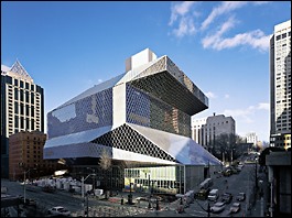
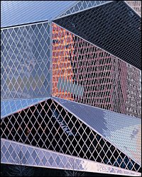
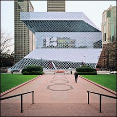
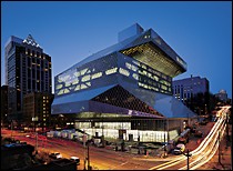
A Rubik's Cube cinched by a corset? A crystal frog poised to leap at the staid federal courthouse up the hill? A Christmas package so lumpy that it torments you with guesses? This silvery net, a faceted jewel crying for attention, is not what we think of as Northwest architecture. Some Seattleites may decide to hate its European polish, its structural nakedness, its crayon colors or its "brutal beauty," in the words of city librarian Deborah Jacobs (who loves it).
No matter. The new library is arguably the most striking and imaginative piece of Seattle architecture since the Space Needle.
I say this as a former doubter. I looked at grainy newspaper illustrations of the intended design and thought Dutch architect Rem Koolhaas (has a designer ever had a better name?) had decided to let function utterly foul form. What was this angular lump? The proposal looked all knees and elbows, as sprawling and undisciplined as internal organs without a proper skin. Boy, was I wrong. This is a building designed to be understood inside out. It is expected to upend your assumptions about structure: In the words of key designer and former Seattleite Joshua Ramus, "A truly rational building will not look rational." In The World According To Koolhaas, a building will not necessarily be a box, with function forced to fit the space, but rather space expanded here and contracting there to fit function. It is like a house with the naturalness of add-ons, built over generations, but these add-ons are integrated from the beginning.
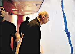
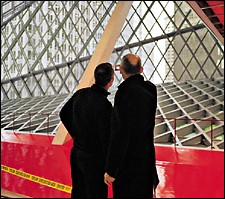
"This is an uncomfortable era in architecture," Koolhaas explained during one of his monthly visits from Rotterdam. "To be monumental rather than used seems to be the fashion." He speaks quietly, intently, a work of architecture himself with his tall, angular frame, balding and sculpted head, feet so long and narrow that they seem like angle irons, and clothes that match the trademark "Men in Black," "Matrix" fashion of his office. If this were a movie, he'd be cast to play himself.
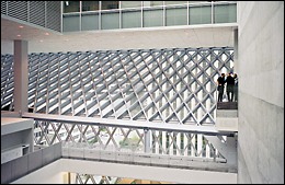
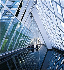
Somehow this glass box conveys not coldness but intimacy. The result is not just a library, but a community hub and global showplace that transcends its own city block between Madison and Spring streets. It reaches out and melds with the downtown towers around it. The mirror-like overhang that shelters the entry on Fourth Avenue ripples like a river from the reflected lights of vehicles passing by. The library's soaring atrium above its "living room" is a diamond-windowed panorama of surrounding buildings, the view changing with each slant of sun, passing cloud, patter of rain or crescent moons of white left by falling snow. The building preens in the mirror of neighboring skyscraper windows, its reflection wavering like water, letting outsiders peek in even as it simultaneously seems to expand out. It is a brilliant play of light, an echo chamber of architectural form, stealing open space from the plazas across the street.
How the devil are patrons supposed to pay attention to their books?
The children's room on Fourth Avenue has a cave-like coziness, while the adult reading room at the building's top expands outward into the sky. The "living room" at the Fifth Avenue level is a glass cathedral and civic lobby, with espresso stand and fiction stacks. The book "spiral," which is actually more of a gentle switchback, is a worm hole of knowledge. The "mixing chamber" or reference area is as dark and glossy and techy (the library will have 320 public-use computers, compared to 20 in the old one) as other areas are day-lit.
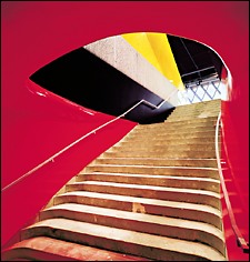
Oddest of all is the public-meeting-room level, a series of curving "bubbles" reached by sinuous, blood-red hallways (shades of Frank Gehry's Experience Music Project) that some will find groovy and others will compare to navigating a colon.
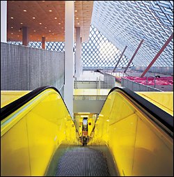
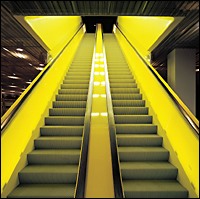
Not to mention the psychedelic green-yellow of glowing escalators, the call numbers inserted in the floors, the floor grates used as railings, the flexible tables mounted on what look like sawhorse trestles, or the stunningly beautiful Floor of Babble: hardwood by artist Ann Hamilton of raised, backward letters in foreign languages that record the first lines of the library's foreign-book collection. Patrons will walk on a woodcut of what seems like a Gutenberg press. How about the decision to toss child's glitter onto black fire insulation and call the finish done? Or quilt the warehouse insulation on the roof and call it a "pillow ceiling" and done as well?
At $273 a square foot, the building is consciously cheap: San Francisco's library cost $480 per square foot. The floors are flashy, the ceilings industrial. The glass grid of the walls serves as seismic bracing, exterior finish and interior finish all in one, saving money and still managing to better the efficiency of the city's energy code by 20 percent. Surfaces are designed for abuse: the odd aluminum floors in the "mixing chamber" are supposed to be scratched over time (it's called patina when it's done on purpose) and the metal-thread "carpet" in other areas is designed to be mopped.
In sum, there's so much to marvel or get mad at that visiting is a hoot. Perhaps no other Seattle building has involved so many really bright people, thinking really hard, about what architecture is supposed to accomplish. THE BOOMING '90s have left Seattle with a renaissance of civic building: the Art Museum, EMP, Benaroya Hall, the Opera House, the two stadiums and revamped Key Arena, the new City Hall and a new federal courthouse. The capstone was the 1998 vote to spend $196.4 million (plus $80 million privately raised) to renovate 27 branch libraries and replace the central library all at once — an ambitious sweep unique among cities. The central library alone cost $165.5 million, including $10 million for a temporary library while the new one was built on the site of its 1960 predecessor. About $14 million comes from the private donations.
Only time will tell how well it works, and if the public will be as enamored of it as city leaders are. Its shape is odd precisely because it's supposed to be so functional, so practical, so logical — and yet the appearance was agonized over to make a splash. When Koolhaas' OMA firm presented it to the library board at a Lake Washington house, members were so stunned they told the architects to go wait on the dock while they argued. Finally, the designers were allowed back inside to hear the verdict: "We don't know what it is, but we can see the design accomplishes what we agreed to."
One of the community leaders who weighed in on the design, former Microsoft executive Paul Maritz, said the bizarre shape could not have been agreed to a year earlier or a year later. A year earlier Seattle lacked the sophistication for the gamble, and a year later the dot-com boom had gone bust. This is a time capsule of civic chutzpah. It also is an attempt to reshuffle how libraries house information. All nonfiction librarian specialists will be gathered in a central "mixing chamber" or platform, connected by both sight and Star-Trek-like Vocera intercoms. These information commandos will guide you to the "spiral" of books — a gently inclined unbroken floor that climbs and climbs, and emphasizes the unity of knowledge. In theory, it will cut your search time for a book in half. Librarian Jacobs did not make the mistake of San Francisco and leave little room for books, on the assumption they are a dead technology. (Bibliophiles wanted to burn that librarian at the stake.) Even though only 32 percent of the library square footage is devoted to books (it is also administrative center, book-sorting center and civic center with auditorium and meeting rooms) it has room for its book collection to double to 1.45 million volumes.
But she, Koolhaas and OMA's Ramus did ask local tech-heads in a series of meetings, which included one at Bill Gates' home, where information was going. The problem of the future, they decided, will not be the scarcity of information that libraries have traditionally addressed by sharing books. Rather, it will be the over-abundance of information brought on by the Internet. Libraries will be in the business of helping patrons separate the wheat from the chaff by helping them sort through the 100,000 Google hits their search engine returned. Glass skin aside, the library is fundamentally designed — in both its public and staff spaces — to meet the Information Age of the 21st century.
Months before opening, librarians were worrying about the possible necessity of locking off bathrooms to curb drug dealing. The men's room is painted an electric seasick green to discourage lingering. Andrew Carnegie must be rolling in his grave. BEFORE THE INEVITABLE glitches and second-guessing, however, understand how this so-logical-it-looks-unlogical building came about.
Libraries are both a very old and very new idea. Old in that they date back to Sumeria. Medieval Baghdad, before its sack by the Mongols, had 36 public libraries when Europe had none. And new in that the idea of tax-supported public libraries in large numbers only dates back to the mass-education movement of the 19th century. In the United States, steel tycoon Carnegie was key to making libraries commonplace, helping finance 2,700 of them. Seattle's first true library was a Carnegie, built at the same site of this new one in 1906.
In 1994, a proposed library levy was defeated. So Jacobs, recruited in 1997 after a successful campaign to build a new library in Corvallis (on time and under budget, which is not quite the case this time around) was hired to rally the city around a "libraries for all" campaign (the phrase was coined by local historian Walt Crowley) that emphasized neighborhood branches as well as downtown. In 1998, near the height of the dot-com boom, voters bit. Why a downtown library at all? Few live nearby. Despite the addition of a parking garage, the central library is still hard to get to. Public libraries are really not as suited to research as university libraries. "It's the heart of the city in the heart of the city," then-mayor Paul Schell justified.
And why Jacobs? At first chance she might seem an unlikely choice for Seattle. A California Valley Girl by geographic origin, she glows with political charisma like the core of a reactor, and isn't afraid to make decisions.
She and the architects spent three months in the United States and Europe looking at and critiquing other libraries. It was Prince Charles, after all, who said the mammoth new British Library "looks like an academy for the secret police." Jacobs determined Seattle could do better than that — better than anyone in the world. She enlisted staff and the public to weigh in, got a consensus for something radical and is confident she is right. "Even if people hate it as a building," she predicts, "when they go inside they will love it as a building." Why Koolhaas? Because he had a reputation as one of architecture's most revolutionary thinkers and had hired, in Ramus, a Harvard-and-Yale-educated genius from Shoreline and Bainbridge Island who was able to turn the ideas derived from an exhaustive public process into dollars-and-cents design.
"This is really Joshua's building," Jacobs notes. He ran with Rem's theories, and at age 34, has a showpiece that may catapult him toward the same level of fame as his boss.
Many details of what Ramus and Koolhaas did are subtle. The tilted pillars transfer loads from the jutting platforms to the conventional parking garage columns far below. The size of the diamond windows resulted from careful calculations of steel, weight and manpower to simplify installation, truck deliveries and crane time. Local contractor Hoffman Construction gets raves from Koolhaas for its work: One employee, nicknamed "Possum," specialized in running back and forth on window framing as it was lifted, helping it tilt to get past the odd protrusions and slide into place.
Above all, the library is designed to be inviting and intuitive to people who want to find a book. Designers calculated that the downtown Barnes & Noble bookstore had 40 times the people traffic, per square foot, as the old library. Why? What was the public sector doing wrong that the private sector is doing right? They want to compete.
This "invasion" of a Dutch outsider was tempered by the hire of a local architectural firm, LMN, to oversee the actual construction. LMN's Sam Miller points out that, far from being a monument to European ideas, the library embraces its surroundings in a completely new way. Only from the inside can you see how it tries to marry Seattle. Architects of surrounding towers will be delighted how the new library becomes a ringside seat to view their work.
It certainly is not perfect. The need to control costs resulted in a structure squatter than initially proposed. In an era when Seattle skyscrapers have finally begun to get interesting roofs, the new library is as dull when viewed from above as it is intriguing from street level. The entries seem subdued — where's the door? — and it will be interesting to see if sound is adequately controlled in the soaring spaces. But instead of being a book warehouse, a predictable generic space, this library demands exploration. Every corner yields surprising perspective. Floors shuffle and peek at each other. To avoid disorientation, signage designer Bruce Mau has inserted clues on all kinds of surfaces to keep patrons from getting lost. "Read the building," Ramus urges. "The last thing we tried to do was make an object. It reacts to its context." As they say in the library biz, check it out.
William Dietrich is a Pacific Northwest magazine staff writer. Benjamin Benschneider is a magazine staff photographer.
|
|
||||||||||||||||||||||||||||||||||||||||||||||||||||||||||||||||||||||||||||||||||||||||||||||||||
seattletimes.com home
Home delivery
| Contact us
| Search archive
| Site map
| Low-graphic
NWclassifieds
| NWsource
| Advertising info
| The Seattle Times Company
