|
|
|||
|
|
So the gap grew between rich and poor? Maybe not ... Return to "Sudden wealth, hard questions"
The lines in this chart represent purchasing power - income adjusted to account for increases in the cost of living. While they have bounced up and down depending on economic conditions and inflation over the last two decades, all income groups have seen real gains since 1980. In 1980, households at the 90th percentile - meaning those making more than 90 percent of households - earned about $8 for every $1 earned by the 10th percentile. Twenty years later the ratio is still $8 to $1. Whether you consider that fair or not, it doesn't appear to have changed significantly in 20 years.
|
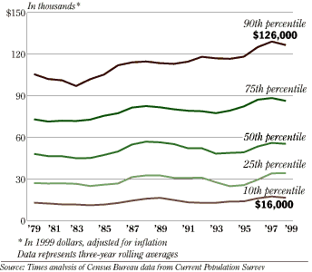 This analysis of household income in Puget Sound, extracted from the Census Bureau¹s Current Population Survey, tells a slightly different story. It suggests that Puget Sound¹s two-decade economic expansion has benefited all income groups, not just the wealthy.
| [ seattletimes.com home ] [ Classified Ads | NWsource.com | Contact Us | Search Archive ] Copyright © 2000 The Seattle Times Company
|